following right after the digital pdf publication by massimo vignelli—the vignelli canon, here comes the hard copy, full version of the pdf.

by massimo vignelli
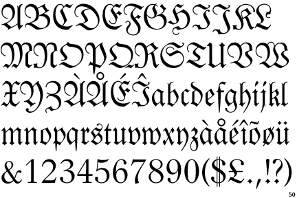
Fraktur
The Fraktur typeface is a part of the Blackletter class in which the name and type denote a decorative, angular, ‘fractured’ style, used historically to write the German language. It was developed in the 16th Century and came to an end in Germany in WWII, after having multiple uses from scientific documents to newspapers.
Design description
Fraktur scripts are decorative, gothic types designed after the Renaissance. Their fractured lines require many strokes and there are curved and angled serifs. Captital letters are formed from C and S shapes and have serifs in these curved shapes. The typeface also makes use of ligatures (such as ß, named the Eszett in German), and the use of the long s (ſ ). Umlauts (accents) are also used in accordance to the German language. Stroke weights are non uniform due to its evolution from the calligraphic Textualis typeface. Fraktur’s economical strengths allowed it to become Germany’s most popular typeface until the 20th Century; its popularity up until this point is summarised: “the narrower letters, the closer letterspacing, and the smaller line spacing” (Bain & Shaw, 1998, p.18).
Classification
The Blackletter (or Gothic Script) type class has evolved through mid 12th to 17th Centuries, and was generally used to write in German. The typeface Fraktur became so popular that it may speak for all Blackletter types, not just the typeface named Fraktur. The word ‘Fraktur’ is Latin, meaning “broken script” (or Bruchschrift in German). Other type styles in the Blackletter class include Tetxualis (more calligraphic), Schwabacher (more of a handwriting style under the influence of Italian Humanist type designers), and Cursiva (a name given to a group of more cursive gothic types). The Fraktur typeface and its variants were used for all types of literature, until the late 18th Century when the Antiqua typeface began taking over for scientific literature, though it remained on top until WWII (Bain & Shaw, 1998, p.40).
Historical background and designer
At the end of the 15th Century Leonhard Wagner designed the Fraktur typeface for a library of books the German emperor Maximilian was to build. He wanted to achieve a more modern look and increasing readability in comparison to the gothic other current Blackletter typefaces, including Textura and Schwabacher, while maintaining its gothic roots. The type styles of Antiqua were becoming popular in Italy at the time, and Maximilian wanted a type unique to Germany. This came to extend beyond signifying Germany and led to a religious significance where Protestants used German in Fraktur, and Catholics used Latin in Antiqua. This held until WWI, when Germany became more open to international influences, until Fraktur was banned in WWII after being noted as of Jewish origin. After the war, Allied forces pushed Antiqua for its legibility, while Fraktur was still associated with Hitler’s reign.
Reference List
Bain, Peter & Shaw, Paul (eds) Blackletter: Type and National Identity, Princeton Architectural Press, New York, 1998.
A Brief History of Fraktur. 1997. The Walden Font Co. 25 July 2010. < http://www.waldenfont.com/content.asp?contentpageID=5>
Taufscheine/Fraktur. 2005. The Historical Society of Berks County. 25 July 2010.
<>
Sherwin, Anne C. Fraktur and German Script. 2009. German Translation Service. 26 July 2010.
Ager, Simon. German (Deutsche). 2010. Omniglot. 26 July 2010.


