Wednesday, August 18, 2010

Regeneration is at the core of understanding the origins of Garamond and the shift to its digital but rather inaccurate depiction of the typeface. The word applies to; essentially the rebirth of the typeface through digital form and a celebration of its wide uses from print to screen media and its true-to the original Adobe Garamond Pro version.

The paper stock was selected for its texture representing the scan-lines of old CRT monitors. The cover R37:G34n8 implies an old and tested video technique of numbers being digitally morphed into letters; the result is the feeling of instability, movement and perhaps confusion. This relates back to Garamond’s history of ill-represented copies of the original typesetter’s (Claude Garamond) work. It also links back to the idea of his work needing to be found and resurrected from obscurity.

The word Re:Gen is abbreviated to reiterate its being used in print and screen media, linking to the social norms of internet users, those of which being common practice; include the abbreviation of words and the obvious link to electronic mail through the lettering of Re: - meaning reply.

The techniques used hint at the seemingly ghost like presence Garamond had grown accustomed to in most of its exposure, a case of mistaken identity, hence the use of a soft corrugated fill (on the back), to demonstrate its slight presence and the original qualities that had been lost after being copied excessively without substance or accuracy. The seepage of ink and embossing of the characters on both sides reiterate these ideas.


My postcard represents the parallel 'war' going on during and after World War II, where the German typeface Fraktur and all its traditional decorative characteristics was challenged by the Allied supported, modernised Antiqua typeface. As Hitler banned Fraktur as a Jewish creation, then as Germany opened up to international influences, Antiqua became the typeface most used in German Newspapers and literature.

Since the letterpress resources doesn't include decorative types, I have used the visual characteristic of a various types in laid out in a 'fractured' composition. The size of the card is about 5x7".

z3258739 Alex Bloom

Sunday, August 15, 2010

anti design festival

an interesting festival, what's your thought on this?

Saturday, August 14, 2010

Bodoni

Originally designed by Giambattista Bodoni (1740 – 1813) in 1798, the Bodoni typeface (see Figure One) has come to be recognised as a series of serif typefaces. Although a pioneering design during its inception (Lupton, 2004, p. 42), the Bodoni typeface has surpassed the vision of its designer, to develop a font, which would express the values of the contemporary aesthetic; current typographers praising the design for its longevity and applicability in the present design climate (Kane, 2002, p. 12).


Figure One: from Bodoni’s Manuale Tipografico


Saturated in a printmaking environment in Eighteenth Century Rome and Parma, and afforded the rare luxury of time and money to devote to his passion in studied typography (Haley, 1992, p. 46), Giambattista Bodoni sought to fashion a typeface, which was to be appreciated as a work of art, valued for its aesthetic qualities, measured above, Haley (1992, p. 46) asserts, its instructive qualities. Studying the advancements made by typographer John Baskerville in his Baskerville type, and the designs of typographers Pierre Simon Fournier and Firmin Didot, the creation of Bodoni’s ‘regal’ typeface (Haley, 1992, p. 46), was revolutionised by concurrent technical advancements in copperplate engraving, permitting his delicateness and intricacy of detail (White, 2005, p. 51). As such, White (2005, pp. 52 – 53) classifies Bodoni’s typeface, along with Firmin Didot’s, Didot, as the evolutionary Modern Didone Serif faces, characterised by their emphasis on a stylistic, engineered quality, as demonstrated by their high stroke contrast and unbracketed serifs.


Bodoni’s typeface has been appropriated and elements emulated in adaptations of the original font. The Bodoni typeface, AFT Bodoni, fashioned by Morris Fuller Benton in 1907 and Louis Höll’s Bauer Bodoni, of 1926, are two of the most widely used and recognised adaptations of Bodoni (Kane, 2002, p. 35). However, the original Bodoni typeface of 1798, being one of Giambattista Bodoni’s later endeavours of typographical exploration (Kane, 2002, p. 34), is the subject of the following description. Lupton (2004, p. 42) describes Giambattista Bodoni’s typeface as ‘radically abstract.’ This account may be attributed to the stylistic decision to emphasise contrast between strokes, the vertical, rather than angled axes and the horizontal and unbracketed serifs, which are indeed, are the characterising elements of the Modern Didone Serif typeface (White, 2005, pp. 52-53). Bodoni’s typeface further stresses a more vertical and condensed uppercase than, for example, Baskerville, whose work Bodoni closely followed (Haley, 1992, p. 46). Another critical point of difference between Bodoni and his contemporaries, which Haley (1992, p. 48) highlights, is his attention to the gradual transition of weight in the strokes and the continuation of bracketing serifs, however slight, rather than Didot’s fixedly unbracketed serifs. Accordingly, although one may classify Bodoni as a pioneer of the Modern Didone Serif, there is a decided tribute to the Transitional, ‘old style’ Serif (Haley, 1992, p. 48).


Whilst the longevity of Bodoni and the enthusiasm to adapt the typeface is testament to its success, its suitability as a read text is largely agreed to be flawed (Kinross, 1992, p. 21). This is attributed, by William Morris, to the ‘rivers of white,’ which leak vertically onto the page, and into which, the extremely thin strokes of the text would disappear (Kinross, 1992, p. 47). Rather, the success of Bodoni lies in its legibility and charisma as a display typeface (White, 2005, p. 53).


Haley (1992, p. 46) states that Giambattista Bodoni would not have been perturbed if confronted with the modern uses of his typeface, perhaps not being exercised in the realm he envisioned for his design. However, Bodoni is praised for remaining ‘always just slightly behind the radical modernism of his contemporary,’ which may explain the longevity of the typeface, rather than a design so radical as to be viewed a mere fad (Haley, 1992, p. 48).


References

Haley, A. (1992). Typographic milestones. New Jersey: John Wiley & Sons, Inc.

Kane, J. (2002). A type primer. London: Laurence King Publishing Ltd.

Kinross, R. (1992). Modern typography, an essay in critical history. London: Hyphen Press.

Lupton, E. (2004). Thinking with type. New York: Princeton Architectural Press.

White, A. (2005). Thinking in type, the practical philosophy of typography. New York: Allworth Press.

Monday, August 9, 2010

BROADWAY typeface


DESCRIPTION OF DESIGN FEATURES
The Broadway typeface has a vintage and Art deco feel to its visual language. The typeface uses contrasting line weights and geometric shapes (circles and rectangles). The bold yet stylish typeface is mostly used for displays and decorative applications.

SERIFS, STROKE WEIGHT AND COUNTERS
There are no serifs in the Broadway typeface. The typeface is more geometric in shape, constructed from rectangles, circles with no serifs. Without serifs, characters are simply grouped together but do not connect or join visually to form one word (unlike script typefaces). Counters are generally in the shape of a semi-circle. The typeface counters are partially filled with a bold stem, this feature is consistent across the Broadway font family, regardless of the shape and size of the character (letter, number or symbol).

Another feature of the Broadway font is the strong (bold) stroke weight in the stem of the character and a lighter stroke weight for the character’s arm, crossbar, shoulder and link. There is a sense of proportion and balance in the contrasting stroke weights of each Broadway character (letter, number or symbol). Each character of the Broadway font demonstrates a balance in positive and negative space.

SUITED APPLICATIONS
The contrast in stroke weights communicates the content/ message with a sense of power and assertiveness, with a stylish and elegant appearance. This typeface is commonly used for signage, for the purpose of communicating to the public. It is typically used for short announcements and displays. Suitable applications for this typeface include posters, billboards, large signage and big headings. The Broadway lettering is a bold font and therefore rarely used for large body of text.

DESIGNER AND HISTORICAL BACKGROUND
Morris Fuller Benton was an American engineer and type designer. Benton (1872-1948) was trained as an engineer and mechanic but later joined the American Type Founders and became one of the leading typeface designers. Benton developed over 200 typefaces for the ATF; many of these fonts are still used today in print media.

Benton’s typeface designs include Century roman, Broadway, Bank Gothic, Franklin Gothic, Garamond and many more. These fonts vary in appearance and suitable applications; some typefaces are designed to be visually stimulating for the purpose of decorative displays and signage, while other typefaces are effective for communicating large body of texts with clarity.

The Broadway typeface was originally created by Morris Fuller Benton in 1927 and the typeface was in designed in upper casing only for ATF (American Type Founders).  The Broadway lower case typeface was later designed by Sol Hess in 1929. The typeface is decorative and possesses the visual language of the Art Deco era. The typeface evokes a feeling of a vintage and retro past.

REFERENCE LIST
2009, Font Designer: Morris Fuller Benton, LinoType, viewed 25 July 2010, <http://www.linotype.com/682/morrisfullerbenton.html>              
2010, Broadway (typeface), Museum of Learning: Explore a virtual museum of knowledge, viewed 25 July 2010, <http://www.museumstuff.com/learn/topics/Broadway_(typeface)>                     
2010, Broadway Font, Ascender Fonts, viewed 25 July 2010, <http://www.ascenderfonts.com/font/broadway.aspx>                    

Fraktur


Fraktur

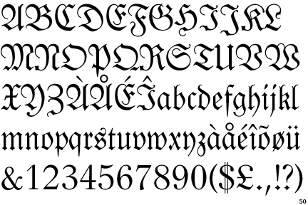
The Fraktur typeface is a part of the Blackletter class in which the name and type denote a decorative, angular, ‘fractured’ style, used historically to write the German language. It was developed in the 16th Century and came to an end in Germany in WWII, after having multiple uses from scientific documents to newspapers.

Design description

Fraktur scripts are decorative, gothic types designed after the Renaissance. Their fractured lines require many strokes and there are curved and angled serifs. Captital letters are formed from C and S shapes and have serifs in these curved shapes. The typeface also makes use of ligatures (such as ß, named the Eszett in German), and the use of the long s (ſ ). Umlauts (accents) are also used in accordance to the German language. Stroke weights are non uniform due to its evolution from the calligraphic Textualis typeface. Fraktur’s economical strengths allowed it to become Germany’s most popular typeface until the 20th Century; its popularity up until this point is summarised: “the narrower letters, the closer letterspacing, and the smaller line spacing” (Bain & Shaw, 1998, p.18).

Classification

The Blackletter (or Gothic Script) type class has evolved through mid 12th to 17th Centuries, and was generally used to write in German. The typeface Fraktur became so popular that it may speak for all Blackletter types, not just the typeface named Fraktur. The word ‘Fraktur’ is Latin, meaning “broken script” (or Bruchschrift in German). Other type styles in the Blackletter class include Tetxualis (more calligraphic), Schwabacher (more of a handwriting style under the influence of Italian Humanist type designers), and Cursiva (a name given to a group of more cursive gothic types). The Fraktur typeface and its variants were used for all types of literature, until the late 18th Century when the Antiqua typeface began taking over for scientific literature, though it remained on top until WWII (Bain & Shaw, 1998, p.40).

Historical background and designer

At the end of the 15th Century Leonhard Wagner designed the Fraktur typeface for a library of books the German emperor Maximilian was to build. He wanted to achieve a more modern look and increasing readability in comparison to the gothic other current Blackletter typefaces, including Textura and Schwabacher, while maintaining its gothic roots. The type styles of Antiqua were becoming popular in Italy at the time, and Maximilian wanted a type unique to Germany. This came to extend beyond signifying Germany and led to a religious significance where Protestants used German in Fraktur, and Catholics used Latin in Antiqua. This held until WWI, when Germany became more open to international influences, until Fraktur was banned in WWII after being noted as of Jewish origin. After the war, Allied forces pushed Antiqua for its legibility, while Fraktur was still associated with Hitler’s reign.


Reference List

Bain, Peter & Shaw, Paul (eds) Blackletter: Type and National Identity, Princeton Architectural Press, New York, 1998.

A Brief History of Fraktur. 1997. The Walden Font Co. 25 July 2010. < http://www.waldenfont.com/content.asp?contentpageID=5>

Taufscheine/Fraktur. 2005. The Historical Society of Berks County. 25 July 2010.

<>

Sherwin, Anne C. Fraktur and German Script. 2009. German Translation Service. 26 July 2010.

Ager, Simon. German (Deutsche). 2010. Omniglot. 26 July 2010.


Friday, August 6, 2010

Baskerville

Baskerville is a serif typeface created by John Baskerville in
1757 in Birmingham, England. This typeface has survived as one of the most widely used and historically used typefaces (The Baskerville Project, 2008). Baskerville was born in 1706 in Wolverley, Worcester, England. By 1723, he had become a writing master and skilled engraver of gravestones then in 1740 started a varnishing business in Birmingham, which became very successful. Around 1750, he began experimenting with casting, papermaking, type founding, printing and ink manufacturing. During these years, Baskerville was responsible for various advances in printing technology, some of which were formulating faster-drying inks, inventing wove paper and improving press platens. His improvements to the printing press made his work more accurate and consistent, more precise and perfect than any printed work previously produced. Such accomplishments then aided him in the design of Baskerville, a typeface with sharper definition and thinner elements than was previously possible. Thus, Baskerville has been classified as a transitional typeface- one that stood between the old fashioned typefaces, calligraphy and script and the modern styles such as Didot and Bodoni.

In spite of being surrounded by the gaudy ornamental style of his generation, Baskerville chose simplicity and quiet refinement both in type design as well as his printing. “His type was designed with delicacy and visual eloquence.” (Fabian, N. 2006) However, Baskerville’s type was highly successful for only a short time. Due to economic issues, the typeface did not gain favor with the English printers, which resulted in the disappearance of his fonts from the commercial market for more than 150 years. Baskerville was revived later in 1917 by Bruce Rogers and others who took interest in it. The type was then used for mechanical composition in the 20th century, which then triggered the release of new Baskerville fonts by Monotype in 1923, Linotype in 1931 and thereafter other manufacturers followed.

Baskerville has mostly been, and still is to this day, used by book designers. The Monotype Baskerville was perhaps the most well known of its time and was a commercially successful type as it was widely regarded as well proportioned. In fact, Hugh Williamson, in Methods of Book Design (1956), regarded it as “One of the most readable and pleasant designs now in use” (Typophile, 2000), which is a judgment which also reflected a broad consensus among mid-twentieth century book designers.

One of the main reasons Baskerville was and still i
s so successful is due to the versatility of the typeface. Baskerville can be used for different designs at different sizes. During the 20th century, Monotype’s was based on a font designed for use at a fairly large size whereas Linotype tended to use a smaller size type. Baskerville, in its various versions, was mostly popular for bookwork during the letterpress era.


A specimen of the Baskerville typeface is shown above, with some of the identifying characteristics being:
• Tail on lowercase g does not close
• Swash-like tail of Q
• J well below baseline
• High crossbar and pointed apex of A
• Top and bottom serifs on C and c
• W and w have no middle stroke
• Long lower arm of E
• Many version feature a calligraphic J
• T has wide arms
• The tail on the lowercase g is open

It is over 250 years since Baskerville’s typeface was first meticulously printed in series of remarkable publications that included the Cambridge Bible. His layouts were known to be ‘revolutionary in its simplicity’ (The Baskerville Project, 2008). It was a defining moment in typography, eradicating the irrelevant decoration of Baskerville’s contemporaries. His typeface formed imitators across Europ
e, his layouts were copied around the world and his pressman ship set new standards for printers everywhere. Today, his leading transitional, serif typeface is still widely used in publishing and printing.


References:

Baines, Phil and Andrew (2002). Type and Typography, London: Lauren King Publishing

Fabian, Nicholas. (2006), John Baskerville, Type Designer: http://www.pointlessart.com/education/loyalist/typeTalk/baskerville/type_page_2.html (Accessed 19.07.10)

Haller, L (1999), Type: Creative Design, Singapore: North Light Books

Lawson, Alexander S (1990), Anatomy of a Typeface, Boston: Godine

The Baskerville Project. (2008): http://www.baskerville.project.com/about (Accessed 19.07.10)

Typophile. Baskerville: http://typophile.com/node/12622 (Accessed 20.07.10)